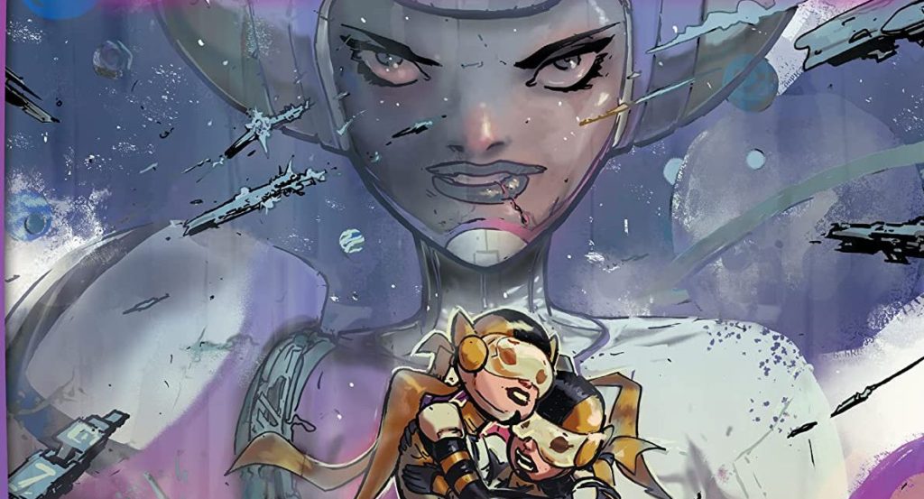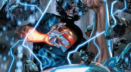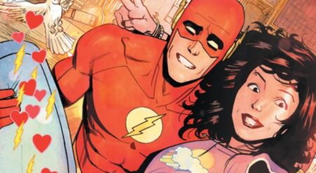
Future State: Legion of Super-Heroes #2 is published by DC Comics, written by Brian Michael Bendis, with art by Riley Rossmo, colors by Ivan Plascencia, and letters by Dave Sharpe. With many of the surviving members of the Legion reunited, the group prepares to confront Element Lad about the destruction of the United Planets. But as they search for answers, what they find will shock them.
By and large, the slate of Future State titles, due to their placement in the future, are kept from impacting their present-day runs. This simple separation is a little murkier where the Legion is involved. With some shocking revelations provided in this issue, one is left wondering whether or not this is a point that Bendis has his regular Legion of Super-Heroes series running toward. With the constant fear of an apocalyptic event driving the Legion in the regular series it seems like all this could be possible. If it is, I can’t wait to see Bendis take the main series through the events that are approaching.
This book picks up right where the last issue left off, as the newly reformed Legion faced off with their former ally Elemental Lad. Well, kind of. It is quickly revealed that the confrontation is all playing out in Elemental Lad’s mind. With this distraction in place, Saturn Girl goes poking around in his head to find some answers before the heroes confront their target properly. What she finds though, she could never prepare for.
Future State: Legion of Super-Heroes #2 turns its narrative on top of its head with this shocking twist. The rest of the story takes the Legion, and particularly Saturn Girl on an entirely different confrontation. One that surprisingly hits even closer to home than confronting their former teammate.
Bendis delivers this narrative with amazing skill. The emotional final confrontation hits perfectly. If you were to simply describe the moment to me, I would expect it to not land nearly as well as it does. Bendis once again shows why he is one of the biggest names in modern comics.
While the writing takes Future State: Legion of Super-Heroes #2 to greater heights than its predecessor, the art, unfortunately, continues to struggle for me. While I continue to dislike some key character redesigns, the art is further hampered by an even greater push to have some of the scenes here present themselves in a manner that calls back to the main series. It does this to so great of an extent that it feels genuinely odd. As scenes unfolded my brain actively wanted to see the pages presented in the art that fills the regular series. I wish artist Rossmo could’ve brought more of an original flair to the book’s design. Had it not tried to cling so hard to the regular series look, the artist’s vastly different style would have had a better chance to shine.
Lastly, we have the lettering. For the most part, the lettering in this book does its job of guiding the reader through the story. The only place where it struggles is during a telepathic conversation between several Legion members. During this discussion, there are no tails used to identify who’s thoughts are who’s. There is a color-coding to keep each side of the conversation separate from the others, but no clear indicator of who’s thoughts are who’s. By about halfway through the scene it has been made clear simply through the context of what is said, but I would’ve appreciated it being made clearer from the start.
When all is said and done Future State: Legion of Super-Heroes #2 gives readers a shocking narrative that delivers an unexpected ending to its story. It’s the unfortunate insistence of clinging to the main series layout designs that seriously hampers its visuals. Combined with a bit of confusing lettering and you get a mixed bag of a book that could’ve been so much more.
Future State: Legion of Super-Heroes #2 is available on February 23rd wherever comics are sold.
Future State: Legion of Super-Heroes Issue #2
TL;DR
When all is said and done Future State: Legion of Super-Heroes #2 gives readers a shocking narrative that delivers an unexpected ending to its story. It’s the unfortunate insistence of clinging to the main series layout designs that seriously hampers its visuals. Combined with a bit of confusing lettering and you get a mixed bag of a book that could’ve been so much more.

