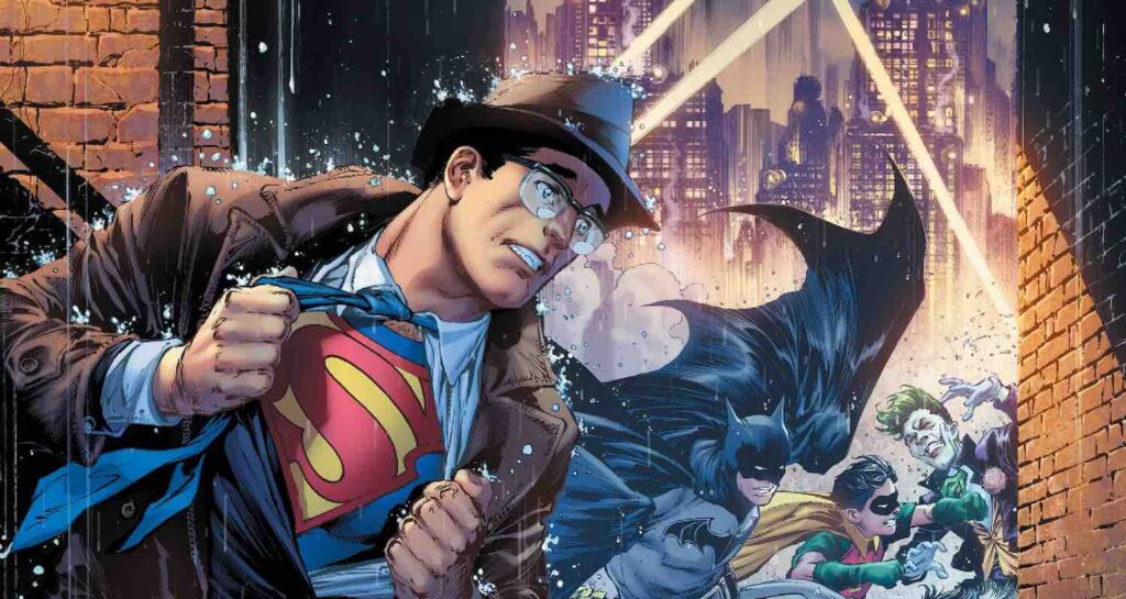
Batman/Superman #17 is published by DC Comics. Written by Gene Luen Yang. The pencils are by Ivan Reis and the inker is Danny Miki. Colours from Sabine Rich. The letterer is Saida Temofonte. Batman and Superman are in the Thermosphere, the huge base controlled by a strange new villain: the Auteur.io. This is a robotic being that seems to view and manipulate alternate realities as if they are Hollywood films. In order to gain more power, Auteur.io brings together two characters from two different Earths. In one: a Superman from a world where Martha Wayne survived and Batman was never created. In the other: A Batman on a planet where Kal-El’s rocket seemingly never reached. The two heroes are forced into uniting against dangerous enemies including the Spider Lady, who looks suspiciously like Lois Lane. But the only two people that may be able to save them are our own Bruce Wayne and Clark Kent.
The plot is a mixed bag because there are multiple plots in this issue. There is this alternate storyline that takes up the majority of the space in the book, and it is an exceptional story. The concept is ingenious as it finds a way for these two stalwarts to meet again for the first time. Yang’s decision to bring them from worlds where the other does not exist is an interesting dynamic. The story is exciting and full of drama, the reader instantly invested in how that world runs. The action is exhilarating and the ending is enthralling.
However, there is the “real world” that bookends Batman/Superman #17 that ends up being odd and awkward. The setup isn’t quite right and the scenes ultimately feel out of place and unneeded. There are numerous ways for this multiple reality concept to be used without forcing it using this method.
The characters from the other universes are strong. Each one of the heroes and their respective supporting casts (Robin and Lois) are iconic and unchanging in their personalities. Superman is as noble as ever and protective over his wife. Batman is untrusting and clever. There are some nice pieces of dialogue as they get to know each other, and the exploration of this new world is fun. There are also some fantastic new versions of both heroes’ enemies, including Joker, Penguin, and Parasite.
The characters in the main universe struggle due to some very bizarre dialogue. For some reason, the way Batman and Superman talk in those moments isn’t effective. The closest comparison would be when characters would describe precisely what was happening and every move they make in classic comics. What’s even weirder is that this problem does not exist in the main story. Auteur.io feels like a character developed purely to create a new world. There is an arrogance and egomaniacal personality attached to the robotic being, but his monologues are wracked in exposition.
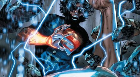
The art is superb for the majority of the issue. Reis and Miki provide some small redesigns to the title characters within these parallel universe counterparts. Changes to Batman’s cowl and Superman’s emblem help identify to the reader that they are different. But it is the alterations made to the enemies that are astonishing. There are these terrifying renditions of classic villains that have turned them into monstrosities and they are beautifully horrifying. There are also fantastic new versions of the Batcave and the Batwing. Whilst Auteur.io may not work as a character within this comic, it looks amazing.
There are two major negatives in relation to art. One is a design choice that affects the entirety of the comic. One of the most common symbols of the book is film negatives. Thus the panels for the main story are designed to look like unrolled strips of film. Initially, this is a novel concept that absolutely works at first. The contents of said panels aren’t bound to the borders, with Superman and other objects frequently breaching out. And the film may bend and burn at the edge as it is assumed that a battle is taking place around it. This dimension manipulation is dynamic and new, but when this format remains throughout the issue it starts to feel restrictive and annoying. The comic also loses a lot of space, with half an inch of the page serving as a plain blue background for the film.
The other negative is the design within the Thermosphere. There is an overabundance of film and there are far too many lines. Miki’s inking tries to mitigate this but the result is that the pages are overcluttered and confusing to look at. Detail is important but in this case, it detracts from everything else in those scenes.
The colours are vibrant and effective. Rich emulates texture very well in Batman/Superman #17. There is a chrome finish to the metallic parts that make up the antagonist, making the robot gleam in the light. And the way that the colours shift through the propellors of the Batwing is a nice touch.
The lettering within the Thermosphere segments is just as confusing as the other factors. Auteur.io’s word balloons have a silver/grey background. There is also a lot of text within those balloons which means they are very hard to read. The primary colour of the location is also grey so the lettering blends in with the lines and shades of everything else in the panel.
Batman/Superman #17 is a comic let down by bizarre design choices. Alternate universes are always fun, and Yang’s concept for these other worlds are really clever. So is having “our” Batman and Superman responsible for saving these other figures. But the issue is then hampered by the Thermosphere scenes, which are poorly designed and have a terrible character inhabiting them. The issue perhaps could have worked if it wasn’t claustrophobic and uncomfortable to read in instances.
Batman/Superman #17 is available where comics are sold.
Batman/Superman #17
TL;DR
Batman/Superman #17 is a comic let down by bizarre design choices. Alternate universes are always fun, and Yang’s concept for these other worlds are really clever. So is having “our” Batman and Superman responsible for saving these other figures. But the issue is then hampered by the Thermosphere scenes, which are poorly designed and have a terrible character inhabiting them. The issue perhaps could have worked if it wasn’t claustrophobic and uncomfortable to read in instances.

