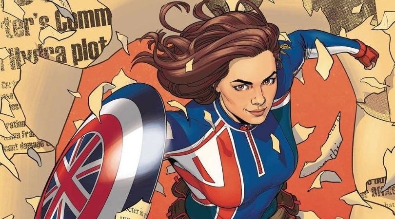
Captain Carter #1 is published by Marvel Comics. Written by Jamie McKelvie, art by Marika Cresta, colors by Erick Arciniega, and letters by Clayton Cowles. Spinning out of the What If…? episode, this first issue looks at what Captain Carter deals with just after being taken out of the ice. As she gets used to her new surroundings, various new parties want Peggy for themselves.
The set-up of this new series is interesting as it is truly uncharted territory. The first scene is taken just as Peggy has woken up, starting exactly as her new life does. This is a great way to start the story as it is a part of the original animation that hasn’t been explored yet. The writer doesn’t dwell on the boat, however, quickly jumping in time to when Carter is settling back into London. There is a slow pace that gives the plot time to expand without rushing it, similar to how the character is settling in herself. The superhero elements in the comic are calm and subtle as the premise takes over. When the action does hit it is a sudden explosion of energy, shocking in the speed at which it happens. Whilst the story doesn’t feature much in the way of surprises, the ending feels pressurized and could change the pace of the plot.
The character is fresh and new and McKelvie appears to delight in delving deeper. There is great subtly in the Captain Carter #1 script that reflects in the character development. The distress that Peggy feels is present but it is beautifully masked by a stoicism we know she has. McKelvie borrows this resolve from Attwell’s performance in the MCU, but that is a very difficult emotion to try and implement in a comic. Perhaps it would be unnoticeable if not for a moment towards the end of the issue that highlights what she has been keeping in.
The art is fantastic. Carter looks amazing, the definition of her muscle deftly visible underneath a uniform. Cresta keeps the reveal of her costume hidden, only brief hints of it on computer screens, although the one she wears at the start is brilliant also. London is brought to life in a fashion that doesn’t relegate it to a location of clichéd landmarks. That subtlety that is expertly crafted in the writing is helped immensely by the art. Peggy’s facial expressions are incredibly specific and recognizable, showing her discomfort at the new world alongside an underlying, permanent strength. The brave face she maintains for the entirety of the issue collapses in a single, small, powerful panel. Alongside the captions, it’s a perfect scene.
Muted colors such as whites, reds, and greys take up much of the panels. This gives objects in the foreground much more prominence, with red being used sporadically but beautifully. The blending of the shades is fascinating to study within the panels of London busses or in the blue of Carter’s costume. The lettering for the word balloons is easy to read. However, the color choice for the captions boxes may be slightly too overpowering and occasionally affects the text.
Captain Carter #1 is a brilliant start. For McKelvie’s first foray into writing, the script is excellent and full of both drama and emotion. The writer is establishing a voice already and it is fantastic to see. Learning more about a character we have only spent a brief period of time with is exciting as it shows that the potential of Captain Carter is thriving. With gorgeous art accompanying the writing this comic is a pleasure to read.
Captain Carter #1 is available where comics are sold March 9th.
Captain Carter #1
TL;DR
Captain Carter #1 is a brilliant start. For McKelvie’s first foray into writing, the script is excellent and full of both drama and emotion. The writer is establishing a voice already and it is fantastic to see. Learning more about a character we have only spent a brief period of time with is exciting as it shows that the potential of Captain Carter is thriving. With gorgeous art accompanying the writing this comic is a pleasure to read.


