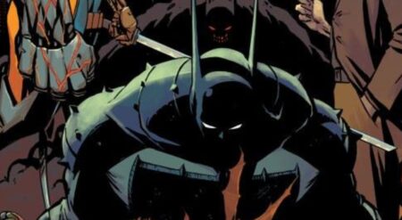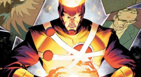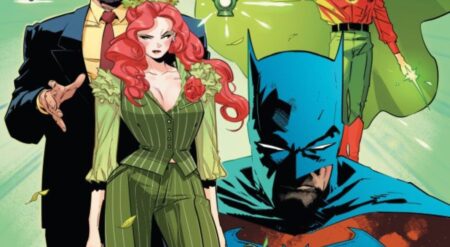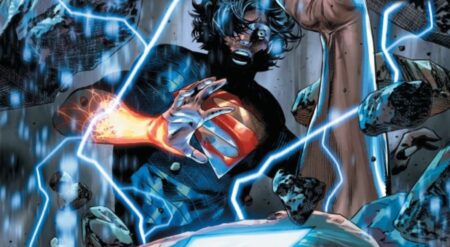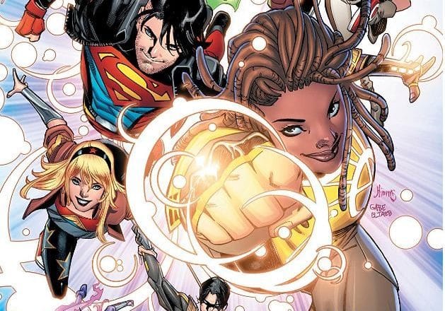
Young Justice #10 is published by Wonder Comics, an imprint of DC Comics, written by Brian Michael Bendis, with art by Nick Derington (pg. 2-7, and 11-12) and John Timms (pg. 1, 8-10, and 13-22), colors by Gabe Eltaeb and Dave Stewart, and letters by Wes Abbott. Previously, we were given our first look at Teen Lantern’s origin story from two months ago, while the remainder of the team in present-day battled with evil Young Justice of Earth-3.
This issue picks up in a similar vein as the previous: with an origin story from two months ago. This time we are witnessing the rise of Jinny Hex. This part of the story is set in Dripping Springs, Texas. Jinny’s life is all over the place as her partner is caught fooling around with someone else, which causes her to walk into the middle of a robbery without even realizing it. Being the badass she is, and being clearly in no mood to take crap from anyone, she busts up the robbery and sends the thieves packing.
Finally returning home, her Mom confronts her about a family inheritance: a mysterious, large trunk, packed to the rafters with ancient magical artifacts. Meanwhile, in the current timeline, the Young Justice team confronts their evil counterparts for the last time in an effort to try and finally find their way back to their own reality.
Young Justice #10 has a giant duck in the room, and I’ll address it, but first let me break down the issue as I normally would.
As with the prior issue, the origin story was fantastic. I love the artwork from Derington, especially during the robbery scene at the bowling alley. The way he conveys Jinny’s facial frustration is brilliant. The use of color from Eltaeb and Stewart is perfectly suited to the tone of the story and clearly different from the present story so that the reader can understand the difference in time. I loved the dialogue between Jinny, the masked thief, and the security guard as the latter tells our hero to take the shot after she finds out it’s her old prom date. The humor here from Bendis is tremendous and, as with the prior issue, it makes me want a standalone Jinny series in this same style. The lettering during this issue continues to be of a very high standard and I love how Abbott letters the heroes and villains alike.
Timms’s artwork in the main timeline is of the highest caliber. In particular, the whole creative team brought it in buckets for the final fight scene. Jinny Hex absolutely steals the show as she finally opens her crate and unleashes her power. I really did love this storyline, as I have noted with a number of the prior issues.
Now, it’s time to address what I’m sure will be the main talking point for everyone in Young Justice #10 during new comic book day this week. Tim Drake, aka Robin, aka Red Robin, has ultimately donned his new codename ‘Drake’. Not only has he changed his pseudonym but with it came a costume change. They’ve been teasing this change within the previous issues and online.
I can’t point the finger at any one creative member here, as I believe they each contributed to the end product of ‘Drake’. I’ve toiled over the right response to this, engaging with my editor, who happens to be the But Why Tho Bat-family expert, and none of it sits well with me.
Firstly, let’s address the name Drake. I’ll save you some time behind the “dangerous bird” meaning. A drake is a male duck. Yep, a duck. Massively underwhelming symbolism when you compare it to other members of the Bat-family. There’s actually a type of Dragon referred to as a Drake, which would have a hundred times been better. Also, what was wrong with Red Robin? Tim is an extremely intelligent member of Batman’s entourage. He was the first person to connect the dots and identify the secret identity of both Batman and Nightwing. So to have him named after a duck feels like it undermines his abilities. If you can’t improve on his secret identity, then don’t.
Secondly, the suit. The actual design I have no issues with. He’s lost the cape and followed a Nightwing style design, which suits him. It’s very different from his Red Robin suit, but it’s practical. The coloring of it though makes it hard not to make the assumption that he’s now being sponsored by UPS. I would have loved to witnessed the conversation as someone said: “What about brown?”. The suit is mostly brown, interwoven with yellow, and a charcoal grey. On his belt, however, are bright red pouches. The contrast between these colors is visually awful. He will definitely look ridiculous next to his counterparts in the Batcave. Bat-family suits have been iconic in the past. If you can’t improve on something then leave it as is. It pops off the page for all the wrong reasons.
I didn’t want it to, but this major universe change really threw me out of the whole issue. If you removed this aspect or had given Tim a stronger name change and suit design, I’d be rating this issue a 4.5/5. As it is though, they didn’t, and I’m just not able to get over this decision.
Young Justice #10 is available in stores now.
Young Justice #10
TL;DR
I didn’t want it to, but the universe change of re-branding Tim Drake as “Drake” and giving him a bland new suit, really threw me out of the whole issue. If you removed this aspect or had given Tim a stronger name change and a better suit design, I’d be rating this issue a 4.5/5. As it is though, they didn’t, and I’m just not able to get over this decision.

