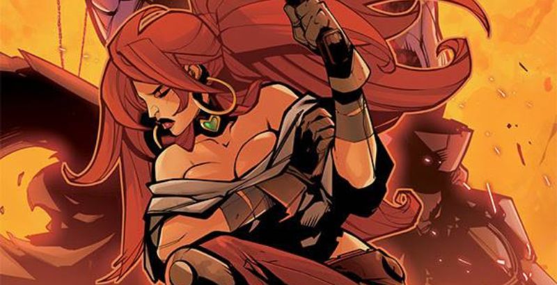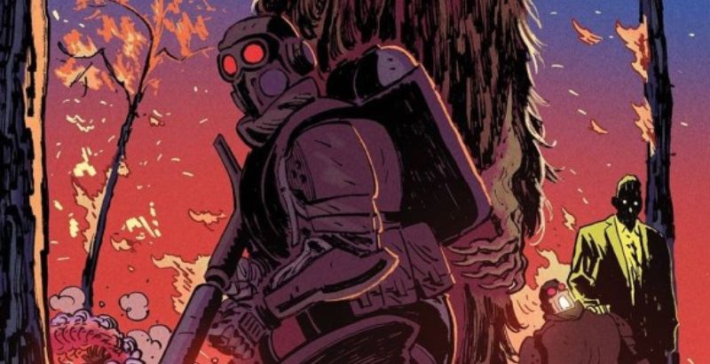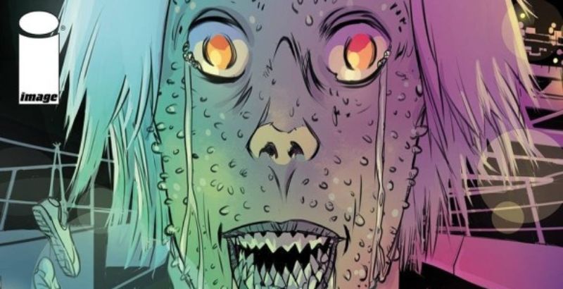
Starhenge #1 is published by Image Comics, with writing and art by Liam Sharp. In the year 2112, humanity has conquered space and endeavors to colonize the stars. But when an ancient alien AI is awakened by a survey team, humanity soon finds itself on the losing side of an intergalactic conflict. There is only one hope for humanity if it wishes to stave off its inevitable defeat.
The tone of a story is a delicate thing. Even if the various elements of a story’s plot come together properly, if the tone is all over the place, the story will feel ill-fitting. It’s like finding two puzzle pieces that fit together but are from different puzzles. They may connect, but the image will be wrong. This is the glaring and inescapable flaw of Starhenge #1,
While the art and larger story speak of an epic space opera with the future of the human race hanging in the balance, the narrator’s voice makes me wonder if this is all a fantasy made up by a stoner on the fly in between hits from his joint. The dialogue used by the narrator utilizes such informal vernacular that it frequently undercuts the momentous feel that the rest of the book is trying to create. It’s like if Rocket Raccoon narrated Star Wars. It might be comical for a moment, but that big lightsaber duel at the end of Return of the Jedi is not going to land right.
Beyond the hard miss of the narrator’s voice, everything else about Starhenge #1 looks like it’s setting out to craft something truly epic and unique. The setup feels grand in scope, though book one does throw a lot of terms and concepts at you, and the few characters that are introduced do a great job of presenting themselves as interesting personalities worth learning more about.
For its part, the art strives to only heighten the grandeur of the story’s setup. The design blends the unfamiliar with the recognizable to keep the reader’s experience new but never alienating. The only time the art stumbles for me is early on when there are some sequences where I simply have no idea what is going on. It comes across as that sort of hard sci-fi opening that is exploring things I’m not supposed to understand, but it feels like it gets the story off on the wrong foot.
The coloring throughout Starhenge #1 does a great job of adding to each moment’s energy. Much of the book is colored in monochromatic color schemes. What color dominates each section of the book does a lot to push certain emotions to the front of the panels.
Wrapping up the book’s presentation is the lettering, which does a fine job of guiding the reader through the story. The only time I found myself mildly confused about how to read a page came from the design of the panels themselves and not from any misplacement of the lettering.
So, when all is said and done, Starhenge #1 starts a story that feels interesting at its core but struggles with some severe clashes in tone. With how prevalent the narrator is throughout this story, this clash hinders the book to a severe degree.
Starhenge #1 is available July 6th, wherever comics are sold.
Starhenge #1
TL;DR
So, when all is said and done, Starhenge #1 starts a story that feels interesting at its core but struggles with some severe clashes in tone. With how prevalent the narrator is throughout this story, this clash hinders the book to a severe degree.


