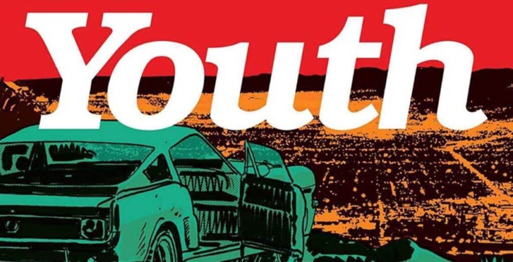
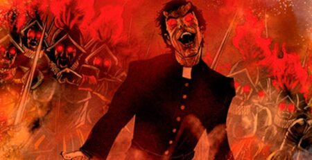
Youth #1 is published by ComiXology Originals, written by Curt Pires, art by Alex Diotto, with colors by Dee Cunniffe and letters by Mycah Myers. Frank works a dead-end job at a burger joint. River is tired of getting mistreated by his stepdad. When the two of them decide enough is enough they hit the open road to find something better. Whether or not what they find is better remains to be seen. But it certainly will change their lives forever.
When the going gets tough, the tough get going. That’s the old saying. And there is certainly something to it. Leaving behind where you are and what you have is never easy. After all, what’s over the horizon could always end up being worse. But, when a person has nothing left to lose sometimes you just gotta go for it. Youth #1 is just that story. It’s about going for it.
Frank and River are introduced as two people being crushed by their lives. Whether it’s by the rude customers at Frank’s job, River’s stepdad talking down to him, or the sneers and insult they get for their affection for each other, life has made it a pastime of kicking these two around. So they acquire themselves a set of wheels and leave it all behind. But just like everything else for Youth #1’s protagonists, things don’t go smoothly for them. While it doesn’t go smoothly, it might just lead to something more than either of them could’ve expected.
The emotional pacing of Youth #1 is potent and quick to hit you. Writer Pires wastes no time setting the tone for this story. And once he sets it, there is no turning back. Things always feel hard for Frank and River. Even when things aren’t actively ruining their lives, it still doesn’t seem like things are going well either. Drugs and the questionable level of their commitment to each other cast a shadow over even the “good” moments in the book. Whether or not the turn of events the issue ends on will lead to a better day, or more opportunities for ruin is something readers will have to wait and see.
The art in Youth #1 does a good job of capturing the broken emotional feeling of the story. The rough style pushes it’s harshness to the forefront in every panel. However, I do think some panels come off a little too rough in their execution.
One thing about the visual presentation I appreciated was the pages that had little or no art. Comics are sold so strongly on their art that you rarely see a page without any. But there are times when it’s right. Putting text boxes on a black page can bring the reader’s attention and focus it solely on what is being said. You just have to make sure the moments are deserving of that attention. I think these moments deserve that attention here.
The colorwork by Cunniffe further serves to enhance the visual presentation of Youth #1. These include a couple of moments like a sunset with Frank and River and a panel involving a burning car particularly well captured through the strong color choices used to enhance the moments.
When it comes to the lettering of Youth #1 it is a bit of a mixed bag. While the font choice made by letterer Myers goes well with the visuals, it is a little messy to read sometimes. While I personally didn’t have too much trouble, I can see it being a problem for some.
All in all, Youth #1 begins its story interestingly and emotionally strongly. While it doesn’t blaze any new trails, it delivers its familiar themes with skill and focus. It will be interesting to see where this story goes from here when issue two comes around.
Youth #1 is available from ComiXology now.
Youth #1
TL;DR
All in all, Youth #1 begins its story in an interesting, and emotionally strong manner. While it doesn’t blaze any new trails, it delivers its familiar themes with skill and focus.

