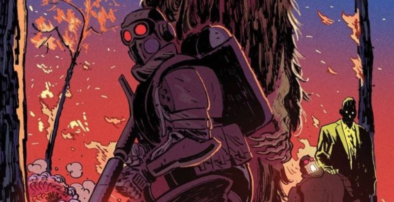
The Warning #10, titled “The House of Fever,” is published Image Comics, written and illustrated by Edward LaRoche, with, colors from Brad Simpson, and letters by Jaymes Reed. In the prior issue, Gladiator Two-Six, and the super soldiers of project Quiet Knife were able, after significant losses to their team, to finally take down the Red Machine, and the Narrowmeer. The issue was rife with tension, and the visuals on the action sequences lept from the page. It was a penultimate story worth of the 4.5 rating it received. Ultimately, The Warning #10, had a high standard to live up to. LaRoche had stated that “issue #10” ends the first act of a three-act saga, and the creator certainly brought his A-game.
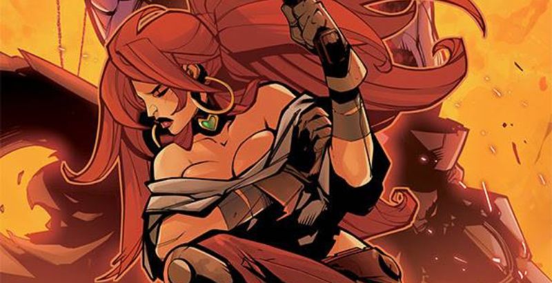
The story opens up seven months prior to the current events on the rogue planet ‘Kodiak 5714-667’, as we pan down onto the landscape. Prin Salu has traveled to confront her Father. The “Grand Duke of House Fever” has been mentioned in prior issues, but this is the first introduction to the character. One thing that elevates this series is LaRoche’s ability to scale his characters, and objects within the panels. Somehow this race of aliens are able to enlarge themselves past their physical constructs and visually it stands to really escalate the impact of the threat of the invasion.
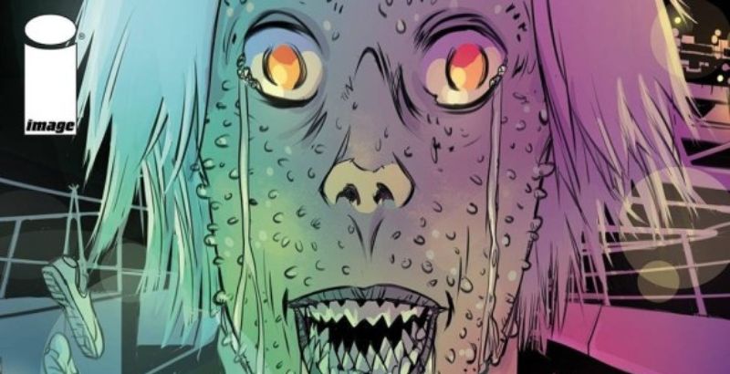
Simpson’s colors in this issue continue to really add an insane amount of depth, as he has done consistently throughout the series. The electro-magnetic skin seen on the Father of the science guild, mentioned above, creates an exquisite, other-worldly texture that is mesmerizing to look at.
The colorist has utilized the electro texture in prior issues in relations to explosions, and some of the action sequences for the Red Machine, but his contributions in issue #10 were brilliant. There are plenty of elements for Simpson to flex his talent, but his prime work is best on show during the beginning and the ending of the issue during the epic final battle.
Similarly, Reed has many instances to imprint his varying style on the dialogue throughout the issue. He manages to fluently transition from inner monologue to militaristic radio chatter, alien communication, and open dialogue. Each piece of lettering is easily identifiable, helping you stay locked deep within the confines of the story.
The accomplishment of this series is not one part, but what Laroche was able to obtain as a whole. I was critical within the first volume, and subsequent issues at the lack of dialogue, but since then the story has found its balance by providing more insight. Ultimately, we’re still left with a lot more questions than answers, but the story feels like it achieved a purpose and a direction that was lacking in the primary issues. LaRoche has promised that his second act, will be set in 15 years in the future, which I believe will allow for more exposition to the original events that unfolded over these 10 issues.
I’m disappointed to see ‘The Warning’ come to its conclusion in this first act, but that serves as the best compliment, as I can see this story stretching out further. I’ve yet to lose enthusiasm over the visual illustrations. In fact, as the story has progressed the visuals have shot this story way above the original expectations I had anticipated.
If you have a deep love of sci-fi horror such as Ridley Scott’s Alien theatrical saga, then Ed LaRoche’s ‘The Warning‘ will tick all of the right boxes for you. I found this particularly surprising as I typically find horror pieces extremely unsettling, but I couldn’t put these stories down and often found myself studying the pages again, and again for all of the hidden details. I look forward to the return of this series, and my hope is, we are not on hiatus too long from this magnificent story.
The Warning #10 is available now wherever comics are sold.
The Warning #10
TL;DR
If you have a deep love of sci-fi horror such as Ridley Scott’s Alien theatrical saga, then Ed LaRoche’s ‘The Warning‘ will tick all of the right boxes for you.


