When you load up Sunderfolk for the first time, the thing that hits you, before the skill cards, before the quirky charm of the NPCs, is the art. It’s instantly warm, deeply textured, and effortlessly readable, even in the middle of chaotic battles. But beyond the visual appeal, there’s an intentionality to how the Sunderfolk visual design presents its world—one built on inclusivity, fantasy flavor, and inviting everyone to the table.
To unpack how all that came together, I sat down with Daren Bader, Sunderfolk’s Art Director and a veteran of both Red Dead and Magic: The Gathering. What followed was a thoughtful conversation about design challenges, collaborative storytelling, toad-shaped regrets, and why sometimes the right visual can trick you into falling in love with a class you didn’t think you’d care about.
This interview has been edited for length and clarity.
BUT WHY THO: The first thing that hits people when they start playing Sunderfolk is just how beautiful the game is. What was your north star when developing the art direction?
DAREN BADER: Gosh, we didn’t have one at first. The idea was, of course, we wanted this dungeon crawl—we were thinking of Dungeons & Dragons. But that sort of fell just a tad short of what we wanted to do, because we really wanted to be inclusive. We wanted a very low barrier of entry for people.
So we didn’t want it to be like, “Oh, it’s just barbarians and knights,” right? Or something like that. We wanted to give players something more to maybe grab onto—something that felt like a wider scope. That’s where the whole concept of animal folk started coming in.
But I guess, as a North Star… there’s the stylization we went with, the content we went with. I think, really, the North Star was the concept of inclusivity, to be honest. We wanted it to just be accessible to people. We didn’t want to put anybody off.
BUT WHY THO: Even in the chaos of battle, characters and effects remain super readable. Was that intentional from the jump, or did clarity evolve over time?
DAREN BADER: We knew we were gonna be top-down, so readability was pretty prominent from the beginning. But we didn’t let it completely stop us. If we had an idea we wanted to pursue, and we thought it had some viability, we’d go for it.
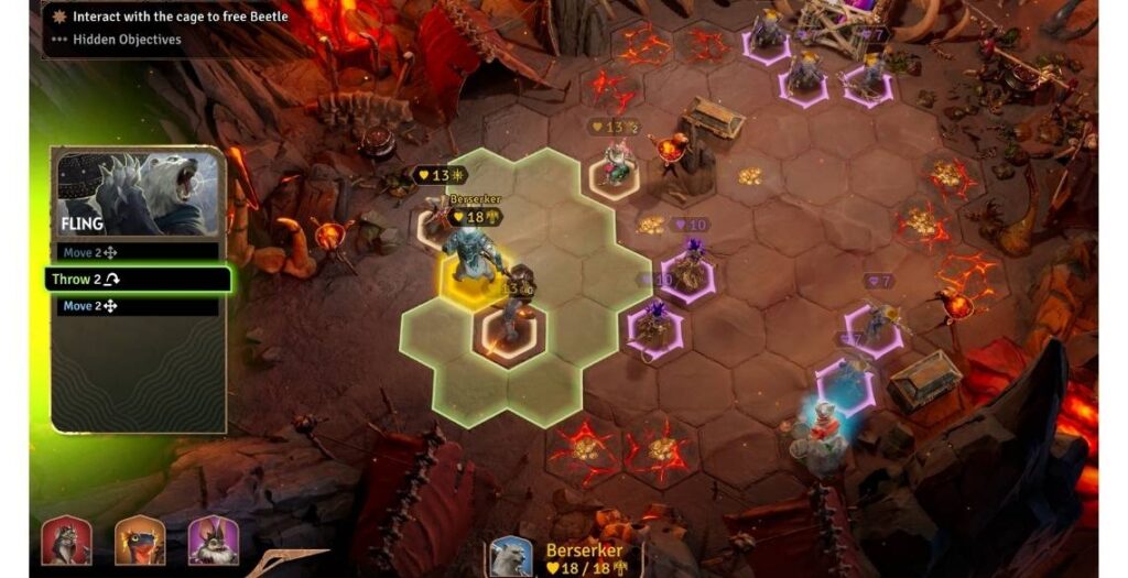
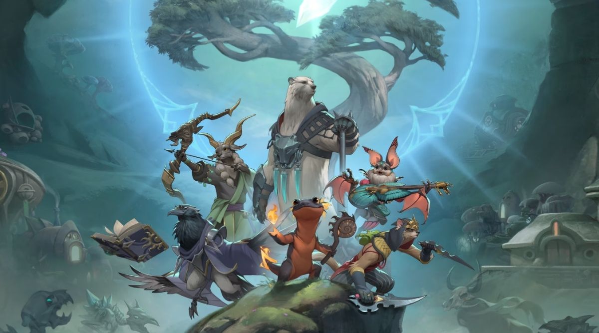
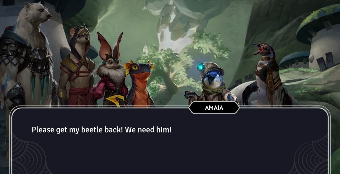
Even the scale differences—we’ve got the Berserker as a giant polar bear, and then we’ve got a salamander. Our range in scale was massive. And we actually tried ’em out really close to what they might be—not a two-inch salamander and a twelve-foot bear, but still with some pretty big differences.
We found that there was a sweet spot, though, where we really had to bring down the big stuff and bring up the little stuff, just so there was a little more overarching visibility of what we were doing. So yeah, I think that top-down perspective—it came in secondary, but it was definitely a very important factor. We just didn’t want it to stop us from exploring ideas.
BUT WHY THO: I’ve played the game on a ton of setups—Steam Deck, Surface, even streamed over Discord—and it looks great everywhere. How did you handle optimization without losing the artistic detail?
DAREN BADER: I would actually say that’s credit to the UX/UI team. Their ability to get all of that information legible—for each one of the characters and everything going on—that, to me, is… I mean, first off, that’s a nightmare from an art director’s standpoint. It’s like, oh my god, we’ve gotta convey all of this information visually.
And then we want visually cool characters, and we want an immersive environment, and all of those things are kind of contradictory. But I do think the cleanliness of the way the interface was implemented really emphasized everything correctly.
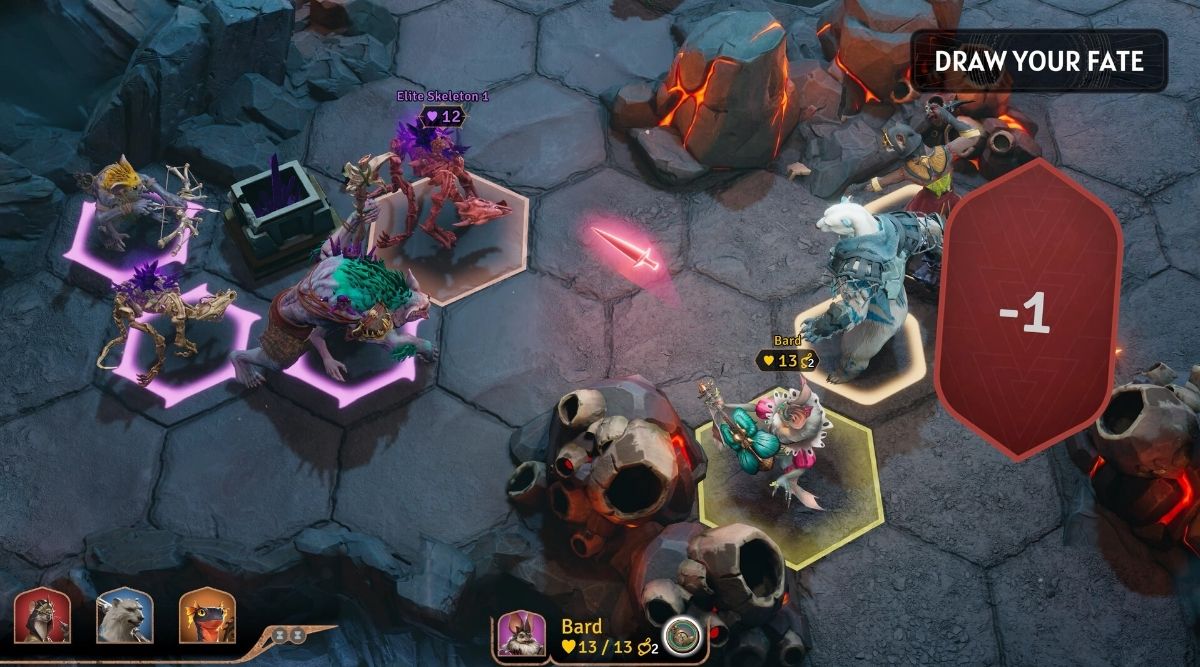
Even down to some of the fine-tuning that was happening at the later end of the development cycle, like getting each character’s ring underneath their model inside the hex. So you could do a quick read of a monster, because it’s got a little bit of a spiky ring, versus a hero, which is smoother and a different color.
Those quick cues help you discern the good guys from the bad guys, yourself from your other players, and things like that. So there’s actually a lot going on there beyond just the character designs themselves.
BUT WHY THO: One of my favorite additions is coordination mode—it makes exploring the map and learning about the world so satisfying. Did you factor in that kind of visual curiosity into the art pipeline?
DAREN BADER: I think to me, it’s definitely rewarding. I’m the kind of player who likes to explore—likes to know what I’m looking at and take a look around at everything. When we added that functionality, it didn’t open the floodgates or anything, but at the same time, we breathed a sigh of relief. If you’re confused about what something is, you can find out.
We weren’t like, “Oh my god, you can’t tell that’s a lava tile,” or anything like that. It became more about understanding that people would have the ability to literally read about each of the aspects they’re seeing. So we didn’t have to rely 100 percent on the visuals alone. That was a really nice moment, feeling like we’re not going to confuse people. They have the ability to figure it out.
BUT WHY THO: I’m colorblind, and while I love the game, there are moments—especially with web tiles or lava—that are hard for me to read. Are there plans to expand accessibility in art and UI?
DAREN BADER: Yeah, I do think we could’ve done a better job at that, to be honest.
Chris Sigaty, our studio head, is actually colorblind, so he was kind of our litmus test. I know he’d say things like, “I can’t tell my greens from my browns here. I don’t know what I’m looking at.” So that kind of accessibility was definitely something we were aware of, and we relied on Chris. If he was having issues, we knew it was something we needed to address.
That said, I’m sure there were times where Chris was like, “I’ve said this before, but I know what I’m doing, so it’s not that confusing,” and maybe he eased off a little. But we probably could’ve taken another pass—just really pinpointed the specific spots that were causing problems and asked, “Okay, how do we address this?”
Whether that’s with more contrast or clarity, light/dark contrast is really your best friend in those moments. But it’s tricky—some of our terrain is darker, some lighter. The sand, for example, can vary in tone. So everything has to read across those changes. It’s a delicate balance.
Honestly, I’d love to hear more about where you were personally having trouble. Let’s get those spots bugged and take a look.
BUT WHY THO: The NPCs are full of life—from Zuri to Bugger. Did the art and writing teams work together to develop those character personalities?
DAREN BADER: When we were doing original character designs, we were just going full bore, and we came up with all different types of animals and creatures and things that we really wanted to see taken a little bit further. And that was actually prior to having a full team for narrative.
Then, once the narrative team came in, they had this full palette to work with. It really came alive once they started writing for these characters, especially ones like the puffin. That’s when the whole town started to feel real.
BUT WHY THO: Any favorite character designs? Or ones that didn’t quite make it in, but you’re still rooting for?
DAREN BADER: I gotta say, I think our toad character is one of the best-designed characters. I just love the face. When you see a toad standing there with that tight little waist, the big belly—that kind of barrel-chested shape—and those huge eyes, it just really works. It was a great design.
That was actually one of the ones that almost made it in as a hero. But we were like, “Okay, we’re at our limit here.” There are so many animals. Personally, I love animals, so whenever I see anything, I’m just like, “Oh, that could be a really cool character.”
And I’m super happy with where we landed, but honestly, that’s probably one of the best things about this IP: there’s so much ground to cover. So many different directions we could go with all these creatures out there.
BUT WHY THO: The fungal characters especially stand out. How did those designs come together?
DAREN BADER: When you think of traditional fantasy tropes, it’s easy to fall into, “Oh, we know what a dragon is. We know what a chimera is. We know Pegasus.” There are so many creatures that we already have clear expectations around.
But then, when you turn around and look at the world around us, there’s this entire environment of fungi in our world. When you start reading about the mycelium network, how trees are interconnected, how they feel and feed and communicate with each other… that whole concept just lit something up in us.
We were like, “This needs to have representation in our world.” It’s this invisible life form that exists all around us, and it felt like the perfect time to bring that in.
And there’s ambiguity to them—are they good? Are they bad? Are they indifferent? They treat their dead differently because to them, death brings more life. There’s a whole philosophical thread to it. That fungal perspective has depth, and it just opened up so many ideas for us.
We were really happy to include that society—that community—because it’s not something people think about often. And it fits so well in our world. We’ve got the underground, we’ve got sentient animals, and all kinds of things. And if you can accept a talking polar bear, then why not a mycelium network of fungal people communicating across the underground?
I just love it. There’s so much depth there.
BUT WHY THO: The Sunderfolk visual design balances cinematic cutscenes with storybook-style interludes. How did you decide when to go full animation versus that paper-flip feel?
DAREN BADER: I think “storybook” is actually a great word to use there.
Of course, from a video game perspective, you want to have cutscenes. The animators want to do the animations—that’s how they want to tell the story. And there’s a lot of depth, literally, in the 3D world that you can explore with that kind of animation.
But there’s also this storybook vibe happening. You’ve got Anjali Bhimani voicing all the characters, and you’re reading through the narrative in that sense. So leaning into that kind of delivery—it really fits.
Aside from the fact that fully executing all those cutscenes would be expensive and a lot of work, leaning into the storybook quality, where the story is being told by anyone, just fits the tone so well. It creates this feeling of enjoying the process, like you’re experiencing this unfolding tale with a sense of wonder.
BUT WHY THO: How much do you think character silhouettes and style influence which heroes players pick?
DAREN BADER: I’ve seen a little bit of both, but again—going back to accessibility—it was really important to us that people feel comfortable. We didn’t want them to feel threatened by the complexity of what this game could be.
That initial response of, “Oh, I like that character. I don’t even know what they do, but I’ll play that one.”—To me, that’s the secret sauce. You’re being tricked into learning about the mechanics because the character is cute, or you’re just drawn to them. That’s how we bring people in.
And honestly, the Bard is exactly that for me. My concept of a Bard has always been, like, “Ugh, I can’t stand Bards.” The lute-playing, the stereotype, all of it. But the Bard in Sunderfolk? It’s one of my favorite characters, right up there with the Pyromancer. They kind of compete for the top spot.
The idea of this bat walking around, playing the lute, being flamboyant and rock ‘n’ roll—it totally sold me on the Bard trope. I get it now. I appreciate it. I understand what a Bard can be because I picked that character just based on style and ended up falling in love with what they actually do.
[Sunderfolk’s visual design] creates this feeling of enjoying the process, like you’re experiencing this unfolding tale with a sense of wonder.
BUT WHY THO: Are there any plans for physical versions of the skill/Fate cards or cosmetic upgrades so players can have the beauty of the Sunderfolk visual design in their hands?
DAREN BADER: We’ve definitely talked about it. We’re all board gamers, so the idea of minis, six-inch figures, or printed cards is really exciting to us. I can’t say anything officially, but yeah, we’ve explored it. I want them all on my shelf.
BUT WHY THO: Even the item descriptions have a distinct tone—funny, but subtle. Did the art team help shape that world flavor?
DAREN BADER: I would say that the humor was there from the moment we decided to go with the animals. So the art team definitely was leaning into that.
You can see that in all the meals. You can see it just in the descriptions of all the trinkets and stuff like that. That just felt like a natural existence in our world. So the art team and the design team and the narrative team, we were hand in hand, like looking for opportunities to have some of that humor.
Where are we gonna show it? How are we gonna have fun with it? And lean into it at the right spots. Which is interesting too, because we had to also tone it back at some moments, because we still wanted to have some weight. We wanted you to feel like, “Hey, this is threatening. I am gonna die. The queen’s gonna get me here. I’m not gonna make it.”
So there was that balance that we were walking. But I’m pretty happy with that line that we’ve ended up on.
BUT WHY THO: Last one. A game like this asks a lot of its creators. What did you learn about yourself while working on Sunderfolk?
DAREN BADER: I’ve been doing video games for 30-something years. I worked at Rockstar forever—on Red Dead and all that kind of stuff. I’ve been all over doing that. And at the same time, I’ve been painting Magic cards since the ’90s, as well as interiors for Monster Manuals and all that stuff for D&D.
But I never would sit down and actually play Magic, or I never would sit down and play D&D. I liked the work. I always loved the fantasy and the visuals, because I’m an artist and I like creating that stuff.
But this is the first time I actually became more interested in the gameplay, and the fun of the game, and the community, and the interactions with people. And it really sank in—this is what’s so fun about this whole world, about this community. It was sitting down and playing these games and having that fun together.
So it felt like, for the first time, the art itself… it wasn’t just for me. It wasn’t only about the art. It was actually about bringing in people and making them feel a certain way, because of this type of game, because of that group of people getting together to play a game.
Whether it’s the decision to lean into storybook charm or the lovingly crafted silhouettes that help you spot your party at a glance, Daren’s fingerprints are all over the Sunderfolk visual design. But more than anything, what stood out during our conversation was how much care went into making the game approachable for players of all backgrounds, playstyles, and setups.
In a game where you can fall in love with a hyena or push an ogre into a pit while giggling like a kid again, it makes sense that the art direction would be as playful and layered as the world itself.
Talking to Daren only reinforced something I already felt: Sunderfolk isn’t just beautiful—it’s intentional, inclusive, and absolutely brimming with heart.
Sunderfolk is available now on PC, PlayStation 5, Switch, and Xbox Series X|S.

