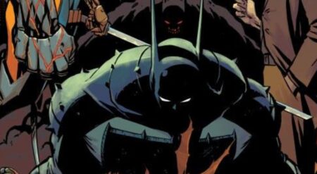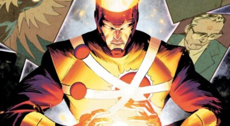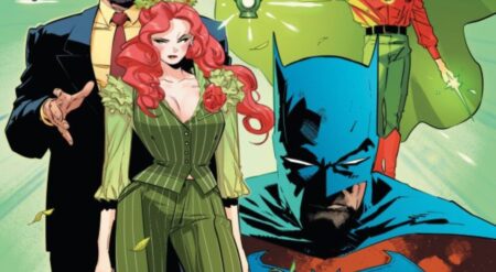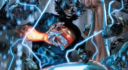
Knight Terrors: Harley Quinn #1 is published by DC Comics, written by Tini Howard, art by Hayden Sherman, colors by Tríona Farrell and letters by Steve Wands. There is a backup story written by Leah Williams, art and colors by Ben Templesmith and letters by Hassan Otsmane-Elhaou. This is part of the Knight Terrors event. Harley finds herself in Arkham, but her nightmares may not be quite as easy to find.
This issue takes a brilliant approach to putting Harley within this event, cleverly splitting the book into two. It begins with a similar premise to the other Knight Terrors issue, framing it around what presumably is Harley’s nightmare. Set within the walls of Arkham, it isn’t long before the dream goes off the rails and is forced to readjust. From there, the structure and plot shifts, turning from manipulation of the past and transforming it into a precarious future. In doing so, it fits in nicely with the current Harley story that is ongoing, talking about the multiverse and the dangers of changing it. It’s a brilliant new direction for the dreamworlds to go in as it can mess with the characters in a way that just trying to scare them with enemies and hallucinations can’t. Harley gets taken on new adventures, ones that really test the possibility of dying in a dream. It’s action-packed and creative, but it sacrifices the primal horror that other Knight Terrors tie-ins feature. But the split between the nightmares is incredibly meaningful.
Knight Terrors: Harley Quinn #1 excellently demonstrates the evolution of the character over the last decade. It opens by delving within the earliest parts of Harley’s history as a character, with Arkham and the Joker, when it is made clear that Quinn has moved far past that period. The battle between Insomnia and Harley is fascinating as it hints at the deep intellect that Harley often hides with her humor. She can pick up on eternal forces interfering with her quicker than most. So then she has fun with it as Howard fills the issue with energised dialogue. The second half of the comic has a structure within itself, with alternate versions of characters becoming Harley’s foes. That is all within a simulation itself, which has a lot of speech in it. This conversation is long and treated like a godlike controller is speaking to Quinn. The comic also taps into the Forth Wall breaking of the protagonist, often describing the plan the villain had to the readers.
The art is terrific as Sherman has to adapt repeatedly, The first page and segment as a whole is a geometrical twist that rapidly loses coherency. The illusion is broken quickly when Harley realises the world is false, so the changing of the scene happens rapidly. There are countless cameos to try and frighten Quinn. Even though they are brief, the designs of all of the guest stars are superb. The lines are very thin, allowing for loads of small, intricate additions within panel lines that are wavy and atypical. And Harley standing still in the middle of this, often looking bored, is hilarious. Then comes the second part of the issue. It alternates between constructing more weird and wonderful worlds, and then an absence of space and detail. The room Harley enters has meta references that are completely unexpected, but around her is largely nothing. The sequences are beautifully built and intensely different to each other, demonstrating the level that the illusions have to get to in order to have an effect on Harley.
The colours are also crucial to that split between the halves of the comic. The part in Arkham is trippy and vibrant, warping in the same way the whole landscape is. Then as the comic progresses and different worlds are introduced, the shades are altered to depict that change. As the letterer, Wands has a lot of dialogue to contend with, but is able to fit it all in nicely and the flow is unaffected.
The backup story continues the trend since the change of creative teams on Harley Quinn to include backups that are thoughtful and more abstract in their art styles. Harley has a confusing conversation with her older self. It’s a blending of time, generations and lives, with some clever locations for the metaphors to take place. The art is dark, yet unique. There are two characters that are the same person, just with one who is much older. So great work is done to generate differences and likenesses at the same time. The colors being so dark and the ethereal tone of some of the shots make this story seem much more sinister and horror-like than the main story. One of the most fascinating aspects of the colors is the skin of both Harleys. They are essentially see-through, matching the color of the background behind them. This creates a general tone throughout the whole panel.
Knight Terrors: Harley Quinn #1 uses a tie-in to truly show how much Harley has grown. The first nightmare might have been damaging years ago, with memories of her abuser and the prison she called home. But that is barely the same Harley Quinn we see now, and this one is not so easily brought to her knees by someone invading her dreams. But the book still takes the opportunity to be adventurous and expressive. It’s not scary like the other Knights Terrors comics can be, but that does not mean it can’t be a nightmare. It’s a comic filled with creators having fun.
Knight Terrors: Harley Quinn #1 is available where comics are sold.
Knight Terrors: Harley Quinn #1
TL;DR
Knight Terrors: Harley Quinn #1 uses a tie-in to truly show how much Harley has grown. The first nightmare might have been damaging years ago, with memories of her abuser and the prison she called home. But that is barely the same Harley Quinn we see now, and this one is not so easily brought to her knees by someone invading her dreams.

