The Panic #1 is a ComiXology Original horror comic published through Migdal Comics, written and lettered by Neil Kleid and art and colours by Andrea Mutti. Annie Delgado is on a train underneath the Hudson River when it crashes. Her friend dies in front of her and she is left with 10 strangers on a trapped carriage with heightened tensions and paranoia.
The set-up of the story is fantastic inside this first issue. Before the crash happens, there are flickers between different periods in time, moving back and forward. This is also used at other points, giving the comic a jittery personality. The tension and nervousness is built way before the train goes off the rails. Then it crashes and the claustrophobia sets in. The plot is set up succinctly, but the hints of much more to the story are deliciously intriguing. Everything is still new, but it is clear from the start that Kleid has a story that is unafraid and full of surprises. This is also a comic that is current, using Covid, protests, and pop culture references to tap into that unease the world is currently under. While on the nose, these inclusions are all helping heighten the paranoia that’s so thematically integral to the comic.
As it mainly takes place in one location, The Panic #1 relies on its character to shine. The main character is brilliantly introduced, then shaken from the start. She’s nervous and obviously distraught early in the issue. The emotions she feels heavily influence the general tone. The anxiety and panic radiate from her as the writer excellently attaches character and story together. The others involved have the beginnings of personalities, and their differences will clearly be the source of the tension in the book. The cast is large among the surviving passengers, but that is important in a comic that will clearly murder many of them.
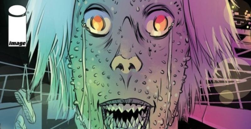
The art is fascinating and brilliant. Mutti has a unique art style that superbly fits the horror genre. The only shapes shown in the panel are what is needed. This is most evident in the facial expression with are incredibly precise. The reactions of the characters are highly important for a horror comic. The shapes that Mutti uses can make a human look inhuman in a second, leading to some really creepy moments. Each person in this issue looks unique in their design, from their shape to their hairstyle to their faces, making it easy to identify them in the chaos. The action and the injuries are intense and shocking in how graphic they can be.
The colours are also really interesting. The primary colour is a light blue, dotted over every panel as the base tone. Other shades are used sporadically and methodically. When the issue begins, Annie has a red coat on her. Under the Hudson, that vibrancy is drained from the place. The tone makes the location look cold and inhospitable. If there is red in the comic after that point, it makes you pay attention. The lettering is simple to read for much of the issue, but in certain places, it looks out of place. On posters and signposts the application looks slightly off and the words don’t sit well on the page.
The Panic #1 is a dramatic new story. From the first pages, it had me captivated. It is almost guaranteed that the plot is much more layered than the first glance. The jumpy nature of the structure and pacing means that we are never comfortable reading, with an unsettling art style too. The setting is different and the tension is intoxicating. This is more than just a horror story, it is a love letter to New York.
The Panic #1 is available exclusively on ComiXology and Amazon.
The Panic #1
TL;DR
The Panic #1 is a dramatic new story. From the first pages, it had me captivated. It is almost guaranteed that the plot is much more layered than the first glance. The jumpy nature of the structure and pacing means that we are never comfortable reading, with an unsettling art style too. The setting is different and the tension is intoxicating. This is more than just a horror story, it is a love letter to New York.


