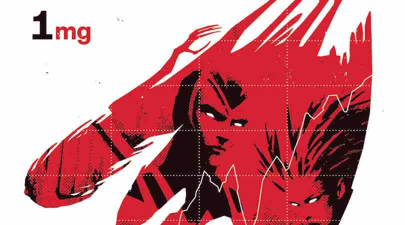
X-Corp #1 is published by Marvel Comics, written by Tini Howard, with art by Alberto Foche, colors by Sunny Gho, VC’s Clayton Cowles, and designs by Tom Muller. Krakoa is moving towards launching its first legal corporation that will have international distribution and cement itself in the global economy.
The issue starts in a very intriguing fashion, as we open during the filming of a promotional video for X-Corp, and the tag line “We’re Simply Superior.” The notion of the promo starts with the word possibility and then attempts to define the word and examine why we as denizens of Earth find a need for something new, something more.
X-Corp #1 is all predicated on that one word, possibility. The word is not inherently positive or negative but simply implies a chance that a particular scenario could come into being if certain actions were taken. So when we first meet with Angel and Penance, they are naturally filled with hopeful possibilities about what the X-Corp venture could mean for Krakoa and the world.
Change is rarely ever met with open arms, though, as the duo quickly finds out. A change in the global economy, the standard of life expectancy, and the shifts in power dynamics have invited challenges. The old world money, and power brokers, are hungry to see this venture crash and burn spectacularly.
I’ll be honest, I wasn’t entirely sure what to expect of this issue or this series, but Howard has managed to adapt the inner workings of corporations into an X-Men story, and I love it. But, again, let’s be frank, this won’t be everyone’s cup of tea, and likely quite a few people may find this dry. That being said, Howard does an excellent job of merging in aspects of corporate espionage and the recruitment of some lesser-known mutants to fill out the X-Corp board.
The visuals from Foche are really quite extraordinary, as they capture landscapes, interior designs, various characters, and even the many forms of Multiple Man. With an overextended issue, Foche really was put to work during this debut issue. It’s hard to point to just one example of the artwork within the issue, as largely it’s all really very good and consistent as well. But if I’m on the spot, I’d have to highlight his work at the conclusion, but that’s a spoiler, so you’ll just have to read the issue. Needless to say, Foche captures the intensity of the scene brilliantly.
Gho’s work on the coloring for the issue was great. The issue itself covers a lot of ground, and they were able to capture the specific nuance of each environment extremely well without missing a beat.
X-Corp is very heavy with dialogue, so Cowles’ lettering becomes key. The speech bubbles were well placed, and the sizing and the font style were easy on the eye. Overall, it kept the issue moving along nicely.
Muller’s designs for the over-arching X-Men design remain consistent and on point with the overall branding of the current Krakoa storyline. It continues to feel all very much part of the same world, which is absolutely key to each of the stories’ connectedness. Additionally, the issue absolutely benefited from the larger-than-average page size, giving the plot more time to breathe and develop.
I, for one, am excited about this series and the complexities of industry Howard will seek to address. While the ongoings of Corporations and international bureaucracy might not be everyone’s cup of tea, this series is absolutely worth the time! It’s Wallstreet meets X-Men. I mean, what’s shadier than men with more money and power than they know what to do with?
X-Corp #1 is available now wherever comics are sold.
X-Corp #1
TL;DR
I, for one, am excited about this series and the complexities of industry Howard will seek to address. While the ongoings of Corporations and international bureaucracy might not be everyone’s cup of tea, this series is absolutely worth the time! It’s Wallstreet meets X-Men. I mean, what’s shadier than men with more money and power than they know what to do with?

