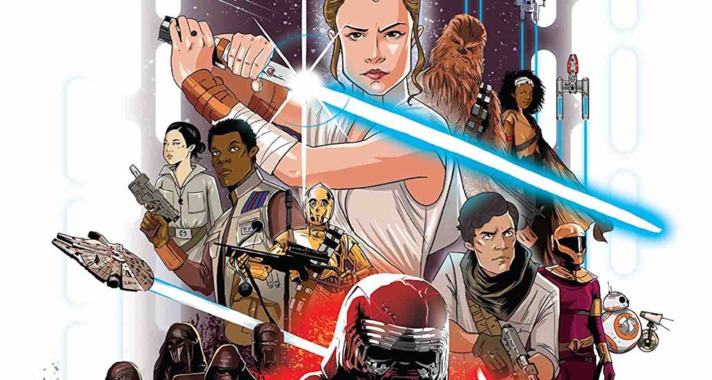
Star Wars: The Rise of Skywalker Graphic Novel Adaptation is created by the team of Alessandro Ferrari, Igor Chimisso, Matteo Piana, Davide Turotti, Kawaii Creative Studio, and Cryssy Cheung, who contribute the manuscript adaptation, character studies and clean up and ink, layout, background paints, character paints, and cover art respectively. It is published by IDW Publishing for a somewhat younger audience.
Personally, I like The Rise of Skywalker. I think it has many issues, but I also don’t think any Star Wars movie is perfect, and as a film unto itself, I find Episode IX enjoyable. However, I do not find this The Rise of Skywalker Graphic Novel Adaptation enjoyable. Its pace is too hurried, the characters are very awkwardly drawn, and none of the emotion of the film is adequately translated on paper.
The original film most definitely had its own pacing problems. But in this adaptation, they feel exacerbated. The book is only about 70 pages long, and while it hits on every sequence in the film, the way it truncates them all to fit into just a few panels make them hard to follow both in plot and emotion. This format also removes much of the charm that I found in the comedic moments. Jokes have entire setups or punchlines ripped away, leaving only the other half. And when things are meant to get emotional, those moments, too, are left feeling uninspired.
The bad pacing is made worse by truly bad character designs. I am absolutely appreciative of using creative art styles to portray characters and by no means need characters to look exactly like their real-life counterparts to feel captivated by a graphic adaptation. The problem with The Rise of Skywalker Graphic Novel Adaptation is that its stylization leaves its characters not only lifeless but frankly unpleasant to look at. Some do look good, especially Jannah, and Poe and Finn grew on me eventually. But Kylo Ren is rough to look at when his mask is off, and Rey is just downright intolerable.
It’s partly because the characters are drawn with strange proportions that make their heads awkwardly shaped and sized. And it’s also because there is not an ounce of life in these characters. When Rey thinks she killed Chewie, it’s one of the most emotionally devastating moments in the film, and Daisy Ridley acts it incredibly. Here, the artist is so preoccupied with the placement of Rey’s hair; there is not a scintilla of pain on her face. The cover art is much preferable, and I would be curious how I felt about this adaptation overall had that style carried through the book.
Fortunately, characters are often drawn so far away in panels that you almost rarely have to look at them close up. And this is bolstered by the fact that the backgrounds are actually gorgeous. It’s the one redeeming factor in this adaptation. Regardless of which planet or exosphere the story is on, the backgrounds are consistently beautiful and even have some really nice touches to them when in space over Exogol.
One other redeeming factor in the lettering is the creative way that droids sound and foreign languages are communicated. I was not sure how I felt about it at first, but by the end, I found it really creative and perhaps a better way for my brain to fill in the sounds it knows than had the lettering been done in all roman characters.
While it has a few redeeming qualities, The Rise of Skywalker Graphic Novel Adaptation is a rather poor showing. It moves too quickly to be funny, impactful, or make much sense of the plot, and the characters are lifeless and hard to look at. While the backgrounds are beautiful, it’s not enough to make this adaptation particularly worth the while.
Star Wars: The Rise of Skywalker Graphic Novel Adaptation is available wherever comics are sold.
Star Wars: The Rise of Skywalker Graphic Novel Adaptation
TL;DR
While it has a few redeeming qualities, The Rise of Skywalker Graphic Novel Adaptation is a rather poor showing. It moves too quickly to be funny, impactful, or make much sense of the plot, and the characters are lifeless and hard to look at. While the backgrounds are beautiful, it’s not enough to make this adaptation particularly worth the while.


