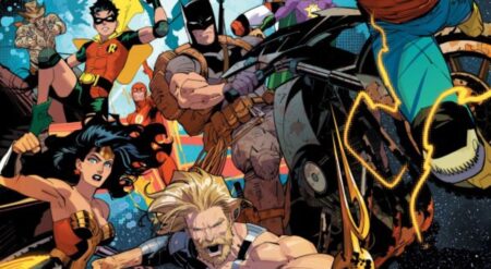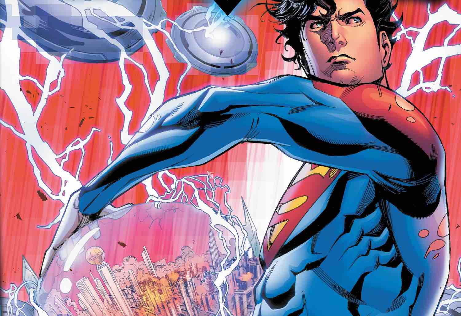
Future State: Superman of Metropolis #1 is published by DC Comics, is written by Sean Lewis and Brandon Easton, with art by Cully Hammer, Michael Avon Deming, Valentine de Landro, and John Timms, and colors by Gabe Eltaeb, Marissa Louise, and Laura Martin, with letters by AndWorld Design and Dave Sharp. Spinning out of the climactic finale of Dark Nights: Death Metal, this series introduces readers to a strikingly different Metropolis. One whose protector is not Clark Kent, but rather his son Jonathan. And Jonathan might just be in a bit over his head.
As with all the other series in the Future State event, this one introduces readers to a new take on its title character and the world he inhabits. And this book wastes no time hitting the ground running. And while it does a solid job of catching the reader up, it is still a dizzying experience for the first stretch of the book.
Future State: Superman of Metropolis #1 feels less like an issue one and more like an issue ten. With a crisis already in full bloom, we find Jon Kent scrambling to resolve the situation. As the military arrives in Metropolis to confront a cybernetic life form, made from Brainiac’s skin cells, who has control over a large swath of the local population, Jon intervenes to keep the innocent bystanders safe. But with the confrontation almost certain to get out of hand, Jon resorts to some drastic measures. Measures which some might not agree with.
Roughly the first half of Future State: Superman of Metropolis #1 follows Jonathan as he enacts his plan to protect Metropolis, as well as the direct repercussions his actions have for him. The back half of the book looks at two different heroes, and their struggles to keep the citizens of Metropolis safe from the startling situation the city finds itself in thanks to Jon. These heroes are more alternate versions of characters familiar to long time DC fans.
The second and third stories in the back half of this book provide a nice contrast in approach and style to the main narrative. As Jon’s fight takes him up against higher-level threats, the other heroes remain much more grounded, dealing with threats closer to home.
The various art styles in Future State: Superman of Metropolis #1 each do a good job of delivering their style of narrative. The art for Jon’s portion of the book leans into the classic superhero style. Jon’s powers are on full display as he soars through the sky looking larger than life. While the art for the other stories embraces the more boots on the ground struggles of their protagonists. Leaving behind the feelings of power that a virtual god-like Superman imparts, and embraces the humanity of the book’s secondary protagonists.
This shift from superheroic to street level is furthered by the book’s colors, as the gleaming shine of Jon’s world is replaced by a duller, and more darkly toned look in the second half of the book. When I think about the lettering I feel a little torn. While it is overall well delivered, there is one story where I can’t say it completely lands.
During this particular story, a lot of the narrative is delivered via a running internal monologue. These thought boxes are delivered in red font on a yellow background. While I understand why these colors were chosen, they are not the easiest combination to look at. While they never bothered my eyes, I would never call them pleasant either.
When all is said and done Future State: Superman of Metropolis #1 delivers an interesting start to its story. While it slams the gas on the plot a bit hard, requiring the reader to take in a lot of backstories, I would say it is overall worth it.
Future State: Superman of Metropolis #1 is available now wherever comics are sold.
Superman of Metropolis #1
TL;DR
When all is said and done Future State: Superman of Metropolis #1 delivers an interesting start to its story. While it slams the gas on the plot a bit hard, requiring the reader to take in a lot of backstories, I would say it is overall worth it.


