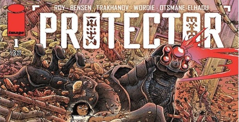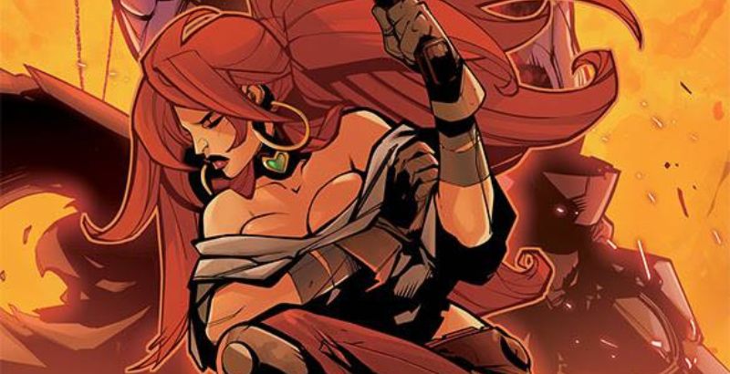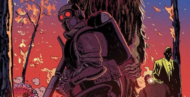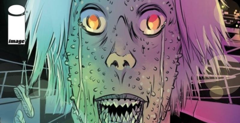
The Protector #1 is published by Image Comics, written by Simon Roy and Daniel Bensen, with art by Artyom Trakhanov, coloring by Jason Wordie, lettering by Hassan Otsmane-Elhaou, logo design by Richard Ballermann, and cover art from James Stokoe.
The story takes place in a desert like area of the Great Lakes in North America. The characters seem to be influenced by Native American culture. This is derived from them speaking on Longhouses. The story follows a tribe, called the Hudsoni, whose taken over another tribe, the Yanqui, in the region and have enslaved them. One Yanqui slave named, Mari, escapes and stumbles upon a secret, which in turn triggers a prophecy of destruction.
The dialogue in The Protector #1 is actually quite sparse at the beginning of the comic. However, that changes near the middle to end of the comic. The way the characters speak fits the characters and does add some believability to the story. The Hudsoni seem to speak with authority and come off a bit boastful as they are a proud tribe. Though there is a lot of unique vocabulary used in the comic that can be confusing to the reader, such as Devas, it’s used quite a bit but isn’t explained what or who they are.
The characters in the story allowed me to connect with them on a different level, being that they are people of color. Though even with that said, some of the characters at first seem to just be placed for the sake of being placed to begin the story. Otherwise more prominent characters come in later on in the issue. Overall, the theme of The Protector #1 focuses primarily on that of slavery being that Mari is a slave who escapes and hunted down by fellow Hudsoni.
The plot seems to be a bit confusing as of right now, but that seems to be natural as this is the first issue. Hopefully, with some more world-building, it can be more easily followed. However, The Protector #1 has some unique lore, with the robot Mari located, and even the weird floating totem in the sky that makes an appearance later on in the comic. I feel as though this may be its strongest selling point, but the pacing of the plot seemed a tad bit rushed and leaves a lot of questions unanswered, which I hope is explained well enough in the later issues.
The most unique aspect of this entire comic would be the art style, which is handled by Trakhanov. It’s quite unconventional and different. This also applies to the use of sound effects, which are done by Otsmane-Elhaou, as well when the characters do something or express themselves. The lettering in The Protector #1 is actually quite easy to follow. The coloring by Jason Wordie, also assists in the way the comic seems to pop out and grabs your attention. I enjoy the color choices used for the characters and also how rich the coloring is in the more action forward pieces. The pages have plenty of space to “breathe” and let the art shine through, especially on pages with a lot of dramatic dialogue.
Overall, The Protector #1, was a decent read. I do hope that the pacing issue is addressed in the future and we get to see more of what’s to come in a much more enjoyable and digestible manner. I say this because The Protector #1 does have a lot of promise, I just don’t want to see it get lost because it moves too fast and leaves too many holes to be filled. So if you’re a reader who enjoys historical fiction, spirits, and/or robots I would say check this comic out.
The Protector #1 is available wherever comics are sold.
The Protector #1
TL;DR
The Protector #1 does have a lot of promise, I just don’t want to see it get lost because it moves too fast and leaves too many holes to be filled. So if you’re a reader who enjoys historical fiction, spirits, and/or robots I would say check this comic out.


