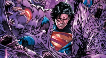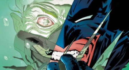
John Stewart: The Emerald Knight #1 is published by DC Comics, written by Geoff Thorne, art by Marco Santucci, colours by Michael Atiyeh, and letters by Rob Leigh. John Stewart and his Guardians have been trapped in the Dark Sector for months, cut off from the outside and with a new form of power source. As they rage war with a god, their forces are running thin.
This is a long one-shot that is created to finish a long strand of the Green Lantern universe, wrapping up loose ends and attempting to free a large string of characters. The bumper size of the comic gives it an epic scale—a war story at the far end of the universe. But this is an army running out of patience, resources, and time. In concept, the book is great. The comic also taps into the abstract areas of the DC multiverse, delving deep into cosmic lore. Whilst it is interesting, a huge amount of exposition weighs down the middle of the comic.
And it isn’t over in one lump sum either, as in a later confrontation there is even more. There is a lot to address; history is being altered and new strands of the fabric of reality are being exposed, but it can be hard to notice in the watches of dialogue. The fights are intense and brilliant, ending the one shot on a high. It isn’t complete, as some giant revelations create a pathway for John and his team to journey towards.
The characters are superbly written when their personalities are allowed to come forth. As mentioned before, there is a lot of dialogue that can sometimes drown out the characteristics. The one figure that is never the case with is John. There is something similar to Captain America about his demeanour. He doesn’t falter in his confidence, putting on a brave face even in the toughest of situations. Even as dissent is beginning to brew, that respect and calmness leave a steady figurehead at the forefront of John Stewart: The Emerald Knight #1. The villain is also great for a one-shot—an ultra-powerful being with megalomaniacal tendencies that seems almost unbeatable.
The art is terrific. This is a book with a gigantic perspective at times, with a lot of bodies fighting over huge spaces and Santucci can capture that fantastically. The characters can be tiny but still easily recognisable, with their constructs and abilities much larger than them. During the close-up panels, especially in heated fight scenes, the inking is incredibly heavy. This leads to a shadowy and ominous feeling within much of the comic. The alien aspect that is crucial to a Green Lantern comic is implemented to perfection. The cities and planets are awesome in scale, and the designs of the characters are tremendous. The hodgepodge of species included is another motif of these comics and that torch is carried excellently.
The colours are sensational and carry with them. They are close to overpowering at times but that leads to a conflict of intense tones in the battle scenes. The green of Stewart and the Lanterns against the orange of Esak and his army oppose and conflict with one another in a glorious display. The lettering is easy to make out among the chaos, although those big stocky word balloons aren’t quite enticing enough to maintain interest.
John Stewart: The Emerald Knight #1 is an issue damaged by one flaw. What it attempts should be respected, taking what could have been a straightforward story and elevating it to a reality-bending level. It was absolutely unexpected and gave the one-shot an edge, pitting John Stewart up against an enormously powerful being. However, the comic stutters with the execution slightly, bogging down with huge exposition that is very clunky and carries too much inside it. Those universal concepts just needed to be addressed in a way that kept the momentum of the story moving forwards. Because aside from those periods it is an exciting conclusion with an entertaining art style.
John Stewart: The Emerald Knight #1 is available wherever comics are sold.
John Stewart: The Emerald Knight #1
TL;DR
ohn Stewart: The Emerald Knight #1 is an issue damaged by one flaw. The comic stutters with the execution slightly, bogging down with huge exposition that is very clunky and carries too much inside it. Those universal concepts just needed to be addressed in a way that kept the momentum of the story moving forwards. Because aside from those periods it is an exciting conclusion with an entertaining art style.

