She is startled awake, and the past events are revealed to have been a dream. Her name is Neoma, and today is her wedding day. The perspective then shifts to a woman speaking to one of her servants about the upcoming wedding. She laments that the bride-to-be is not young enough for the groom. She insinuates that he had something to do with the death of a younger girl who would have been better suited for him. But when the dust settles, Neoma may be more than any of them can handle.
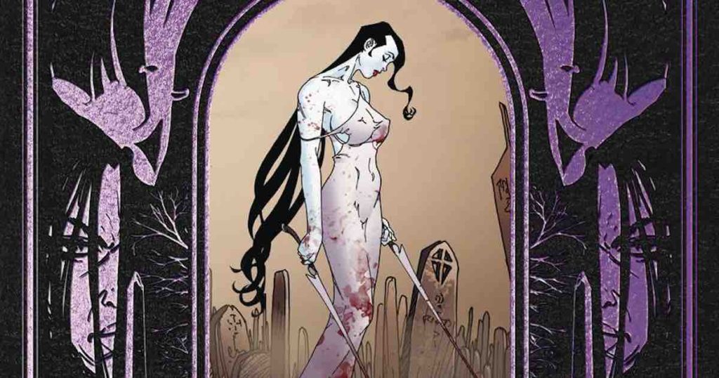
Maiden #1 is a very strange story that I couldn’t quite get into. The premise is extremely interesting. A timeless assassin who lives to avenge murdered women prepares to kill her monstrous fiance. But the presentation was so focused on its cleverness and mystique that the story felt a bit flat. The dream sequence at the beginning was confusing and would have benefitted from a hint that the protagonist was sleeping as it took place. The setting is a blend of Japanese fetishism and cyberpunk aesthetic with no real clarity on when or where it takes place.
This wouldn’t be a big deal if the story was compelling or had a lot of forwarding momentum. But, sadly, it doesn’t do very much. Sears spends a lot of time establishing plot threads but very little time following them. By the time that the brief tale has ended, it feels like it’s just getting started. This isn’t to say that there was nothing of value with the story. I really liked how the last few pages mirror the first few and seem to set up the beginning as a foreshadowing.
The art from Sears is solid. Characters are often posed in ways that accentuate their forms to make them as striking and beautiful as possible. I’d have liked to have seen a few different body types for the women, though. Sears’ style has a flowing and beautiful nature that compliments the story very well. Panels will often be pulled back from the action to show more of what is happening, which helps make everything feel more fluid and moving. The letters are also well implemented. Sears utilizes unique fonts and text bubble styles to emphasize internal monologue vs. speaking to strong effect. The colors from Pillai are solid. The palette rests primarily in blues and splashes of red. Thanks to this, Pillai’s colors lend a sleepy, dreamlike quality that enhances each panel.
Overall, I’m mixed with how I feel about Maiden #1. The story felt like it quit right before it got to the good part, but the premise is intriguing. The art was solid and helped tie the more abstract elements of the story together. I’m interested in what happens next in this series, but it could be difficult for everyone to get into. If you’re a fan of revenge stories, this might be right up your alley, though.
Maiden #1 is available now through the Heavy Metal Website.
Maiden #1
TL;DR
Overall, I’m mixed with how I feel about Maiden #1. The story felt like it quit right before it got to the good part, but the premise is intriguing. The art was solid and helped tie the more abstract parts of the story together.

