The Warning #1 is the start to a series published by Image Comics, created, written and with art from Edward Laroche with colors from Brad Simpson, and letters by Jaymes Reed. The series follows a multinational combat team set with responding to a warning sent only by those who are slowly approaching Earth through space.
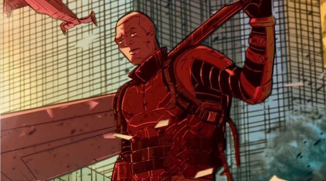
In The Warning #1, we are introduced to what I assume is our team, although it isn’t explicitly stated for each member. We are shown them at varying times, some three months ago, another four months, and so on. This breaking down of each introduction into different points of time serves to highlight characters, in which I assume, are situations that will set up their varied personalities for the series.
First and foremost, the bulk of the dialogue uses military jargon, whether it’s in directives or proposals, and even begins with some heavy science lifting for the reader when we meet our first character. This could make the comic a little inaccessible for those who read with an intent to understand every word, but personally, I found that it set the lives of each character into perspective and got me into the world of The Warning.
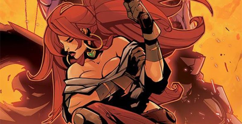
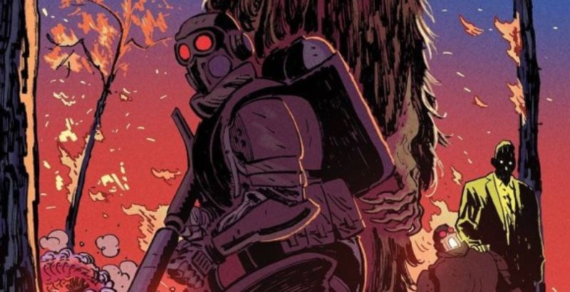
With the exception of one character, Freya, the others seem untouchable, with her panels showing her as a little broken, irreverent, and more outside the military than in it, despite speaking to a colonel on the phone. The others we see in planes, taking orders, or debriefing. As well as a large focus on military, in and around planes in beautiful panels colored in almost monochromatic schemes that set the tone for war, fear, and taking orders.
That being said, this dialogue is dry and not really engaging outside of the bits with Freya. But I will be picking up issue number two for the opening thoughts highlighted in the issue. The words are simple: “Was I kind to you?” Thought and placed in a purple box with a deep yellow sky, with a beautiful flower and bee that stand in stark contrast to the rest of the book’s colors.
“Did you think you were a good man?”
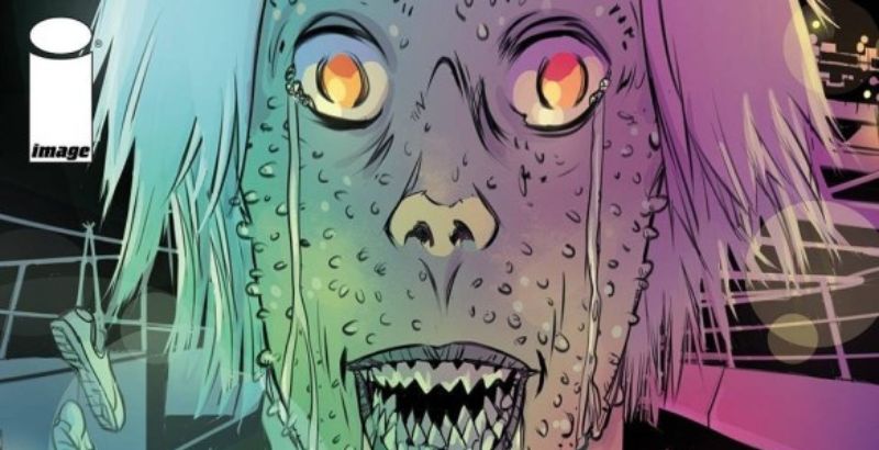
The scene transitions to the green-colored insides of a plane with medical jargon breaking into the ephemeral thoughts on the page. This is echoed in the closing of the issue and the softness of the words and their contrast to the military-speak and jargon throughout the book keep me engaged when the middle bit left me a little bored. I can’t wait to see how The Warning develops beyond this set-up. Laroche’s writing in the beginning really hit me and was the perfect accent to the world he crafts later on. I’m looking forward to seeing how this evolves in later issues.


