Justice League #74 is published by DC Comics. Written by Brian Michael Bendis, art by Szymon Kudranski, Emanuela Lupacchino and Wade Von Grawbadger, colours by Kudranski and Hi-Fi, and letters by Josh Reed.
Black Adam has been possessed by Xanadoth, a Lord of Chaos, and has been battling the Justice League Dark. The Justice League summoned Nabu to try and gain its aid in battling Xanadoth, but all Nabu did was kidnap Naomi. In this issue, the Justice Leagues unite to battle Xanadoth and try to rescue Black Adam, whilst Naomi learns just how powerful she could be.
The final part of this arc, Justice League #74 concludes a large and intense battle. For much of this story, the Justice League has been on the sidelines due to the mystical nature of the threat. Here Bendis brings the two teams together in a way that feels excited and rewarding. The pace is slow throughout as the grandiosity takes precedent over the action. This can lead to the comic dragging at some points. The battle isn’t this all-out slugfest, it’s more drawn out than that. It is a dark book at periods, but the end is full of both hope and brightness, which is much needed in a Justice League book.
With so many characters involved, Bendis does a superb job of making sure that certain figures make their presence count. Naomi suddenly is given a big role in the story, treated as an extremely powerful trump card. The threads around her anxiety and her imposter syndrome have woven into this issue too, and the dialogue regarding how other heroes react to this is both poignant and beautiful. Black Adam’s menace as the unwilling villain of the issue is evident, but perhaps more could have been done to show off his power. It has been too much of him just floating in the same spot as the voice of Xanadoth speaks through his.
There is also the presence of the Justice League Dark. Most of the members don’t do a lot, including Constantine and Detective Chimp, but their voices remain humorous. But for Doctor Fate and Zatanna, they prove a pivotal part of this comic’s highlights.
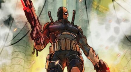
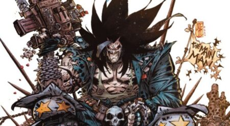
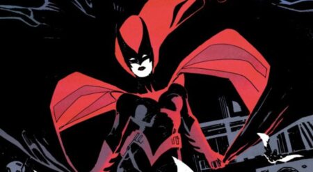
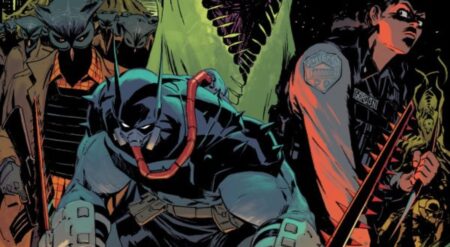
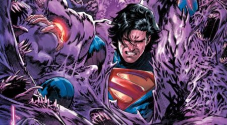
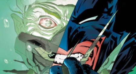
As with every other issue of this arc, the art is a collaboration. The bulk of this issue and the fight is held under the art of Kudranski, which is surprising due to how dark the style is. Much of the comic is shrouded in shadow, the figures illuminated in their outlines and glimpses of detail. It is a striking and unique style. More detail is added in certain panels, either extreme having a powerful effect. Kudranski’s art resembles a foil engraving painting and is fascinating. There weren’t as many different characters under this artist in the other issues, so it is really interesting to see how they are presented here. However, the darkness of the comic and having to really focus to understand what is happening and who is actually on the page can be tiring.
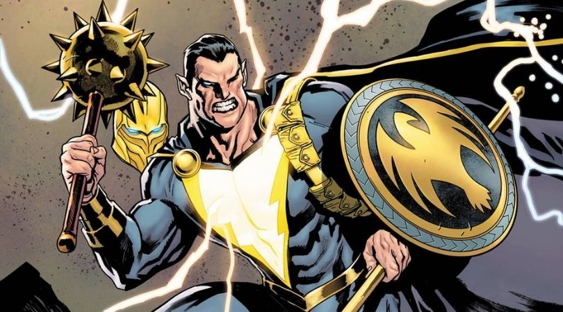
Lupacchino’s art intersperses Kudranki’s, opposing the style as well. Lupacchino has an abundance of light in contrast to the darkness, but still minimises the space within the page. This leads to some large portraits of the heroes and villains. These are epic depictions of the various figures packed with detail, necessary as they are the only thing visible. And then Von Grawbadger provides the last pages. It’s a calmer art style, though still brilliant, which provides some time to try and process what has happened. Von Grawbadger illustrates perhaps more characters than the other two, rife with brilliant detail and emotions.
The colours inside Kudranski’s pages are stunning. There is an explosion of colour on each page, from reds to blues to golds. And where in previous issues these tones stood alone, now they are in conflict of blending with each other. The displays of powers are incredible. The little splashes of paint on the page add a character and energy to scenes that are already dynamic already. It is as if each person has an aura that is transcended beyond them.
The colours by Hi-Fi are fantastic also. In Lupacchino’s pages, there is a lot of white, serving as an empty void. But it is so helpful as it takes us out of the darkness and provides a breather before entering the gloominess at Kahndaq. There is also a wonderful use of gold and yellow, a shade that resists being submerged by the overpowering white. Then, among the final scenes, there is an abundance of colours, as this represented the “normal” plane of existence the heroes occupy.
The lettering has a lot of custom word balloons and fonts coincide with the many magical beings that appear in this issue. These fonts are ultimately irritating and can often be difficult to read.
Justice League #74 is a satisfying end to the arc. Bendis pulls out a conclusion of great magnitude. The characters are fantastic and the team-up between the two teams really works well. It avoids standard tropes of conflict between the groups and they function largely like an extended roster of the team. Whilst the comic loses ground, the art saves it by being jaw-dropping. Lupacchino and Von Grawbadger are terrific artists who can carry a Justice League book on their own. But Kudranski’s art style is one of the most awe-inspiring I have ever seen. It is certainly not for everyone, but it is definitely worth a try.
Justice League #74 is available where comics are sold.
Justice League #74
TL;DR
Justice League #74 is a satisfying end to the arc. Bendis pulls out a conclusion of great magnitude. The characters are fantastic and the team-up between the two teams really works well. It avoids standard tropes of conflict between the groups and they function largely like an extended roster of the team. Whilst the comic loses ground, the art saves it by being jaw-dropping. Lupacchino and Von Grawbadger are terrific artists who can carry a Justice League book on their own. But Kudranski’s art style is one of the most awe-inspiring I have ever seen. It is certainly not for everyone, but it is definitely worth a try.

